

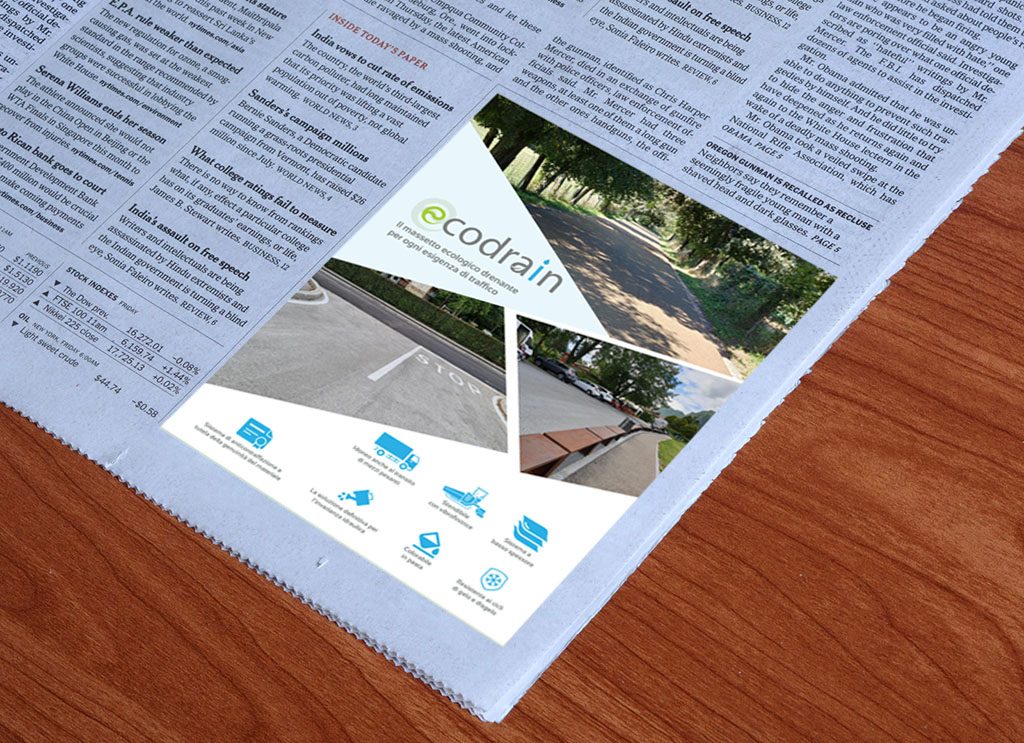
An effective advertisement combines a clear visual hierarchy, a strong central image, minimal clutter, and an obvious call to action — all consistent with your brand identity. Clarity and simplicity consistently outperform trying to communicate too much at once.
Table of Contents
- The Core Elements of an Effective Ad
- Visual Hierarchy: Guiding the Eye
- The Role of the Call to Action
- Designing for Different Platforms
- Common Mistakes to Avoid
- FAQ
The Core Elements of an Effective Ad
Graphic design advertisements combine images, color, typography, and layout to communicate a message clearly and encourage a specific action — whether that’s visiting a website, making a purchase, or remembering a brand. The most consistent principle across effective ads is simplicity: a clean design without unnecessary clutter lets the main message stand out, rather than competing with everything else on the page.
Visual Hierarchy: Guiding the Eye
Strong ads guide the viewer’s eye deliberately — using contrast (light against dark, bold against subtle, large against small) to make key elements stand out from one another. Since images are usually the first thing a person notices, image quality matters — a blurry or generic stock photo undermines an otherwise strong ad.
The Role of the Call to Action
A clear, visually distinct call to action (CTA) is one of the most important elements of an effective ad — it tells the viewer exactly what to do next. The strongest CTAs are short, direct, and visually separated from the rest of the design, so they’re impossible to miss.
Designing for Different Platforms
The same ad rarely works identically across every platform. A mobile ad needs compact, easily scannable elements; a billboard needs bold, large-scale visuals readable from a distance. Adapting layout and scale to where the ad will actually be seen makes a meaningful difference in how well it performs.
Common Mistakes to Avoid
- Cramming too much text or too many messages into one ad
- Inconsistent branding compared to your other marketing materials
- Low-quality or generic stock imagery
- A CTA that’s hard to find or unclear about what happens next
- Ignoring how the ad will actually look on the platform it’s published on
FAQ
Should an ad focus on one message, or can it cover multiple points?
One message. Ads that try to communicate too much at once tend to confuse the viewer and dilute the impact — a single, clear message consistently performs better.
How important is the call to action, really?
Very — an ad can have great visuals and copy, but without a clear, visible next step, it’s much less likely to convert interest into action.
Do I need different ad designs for social media, print, and web?
Generally, yes. Each platform has different size constraints and viewing contexts — a design that works well on a phone screen isn’t automatically effective as a billboard or a printed flyer.
This is part of our Marketing Collateral services, within our full AI Brand Strategy, Corporate Identity & Marketing Collateral Design Services.
Get your free quote on WhatsApp
← Back to AI Brand Strategy, Corporate Identity & Marketing Collateral Design Services
DATI TECNICI SEO
- Focus keyword: what makes an advertisement design effective
- Focus keyword coda lunga: graphic design advertisement tips for small business
- SEO Title: What Makes a Graphic Design Advertisement Actually Effective? | Ricrea Grafica
- Meta Description: The core principles behind effective advertisement design — visual hierarchy, clear CTAs, and common mistakes to avoid.
- Excerpt: What separates an ad that gets noticed from one that gets ignored.
- URL slug: /creative-blog/what-makes-an-advertisement-design-effective/
TAG
- advertisement design
- graphic design
- marketing collateral
- brand identity
- visual hierarchy
- call to action
- creative advertising
- ad layout
- conversion desig
- small business marketing
- digital advertising
- visual strategy
