What is a Presentation Designer?
A presentation designer is an ever-evolving role, and therefore a presentation designer needs to be an individual who is consistently on the lookout for new presentation trends and always taking on new skills. They should have a strong eye for design, particularly when it comes to Powerpoint slides and presentation layouts.
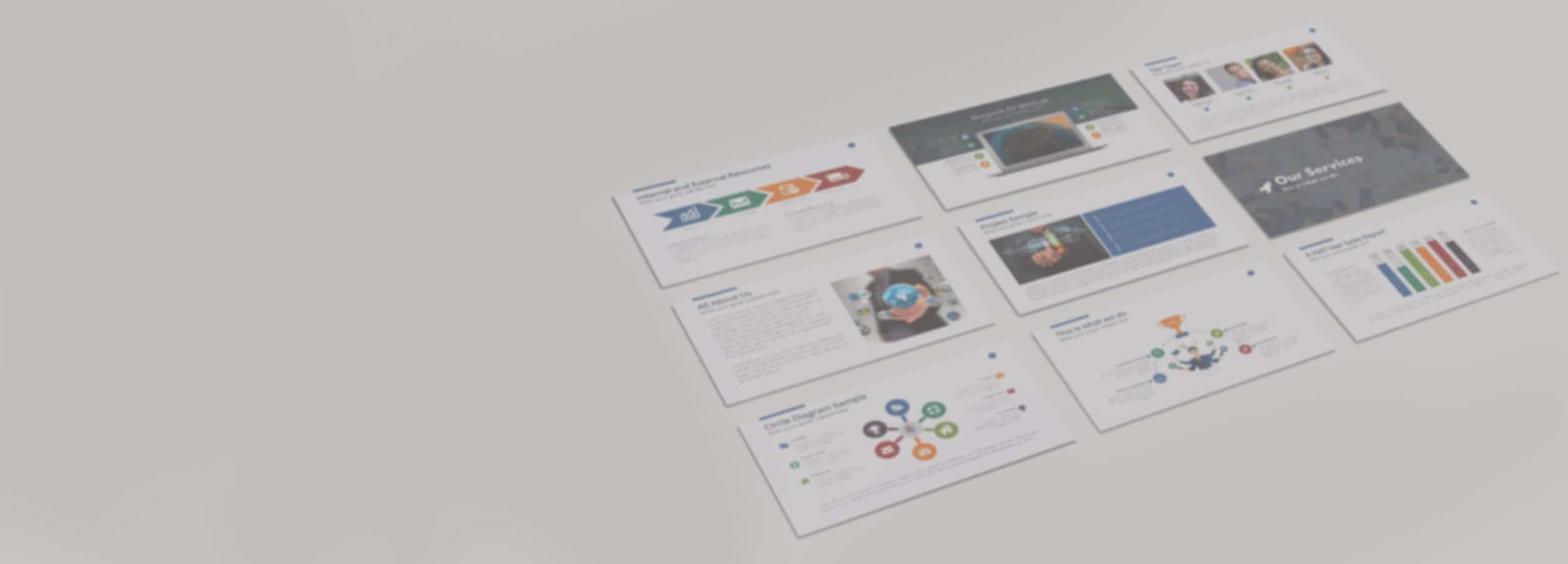
This is a niche design role, and a presentation designer’s main responsibility is to uphold brand standards while creating effective, dynamic and well-thought-out internal and external presentations that are readable in multiple formats (e.g. tablet, computer, mobile).
What does a Presentation Designer do, typically?

A presentation designer will have experience designing templates and layouts and will be able to follow strict brand guidelines. They are quickly able to solve issues like blurry images, confusing layouts, and ineffective design. Their daily responsibilities can include:
- Intimate knowledge of presentation programs such as PowerPoint, Google Slides, Prezi and Keynote
- Knowledge of Adobe Creative Suite programs such as Photoshop, InDesign and Illustrator
- Ability to work under pressure and handle a wide range of tasks and projects at the same time
- Upholding brand guidelines and possessing a strong knowledge of design standards
- Working with internal and external stakeholders to ensure all brand presentation is of a high standard
- Having a good eye for design and aesthetics to create well-thought-out presentations
Misconceptions about Presentation Design services
While a presentation designer does need to have a good eye for aesthetics, they are not graphic designers. The focus of a presentation designer is purely on creating effective presentations for an organization and they will have extensive knowledge and experience in this particular area of design.
Important metrics for a Powerpoint Presentation Designer
1. Time from initial idea to final product
How long it takes for a presentation designer to create presentations and the cost for the amount of time it takes.
2. Engagement rate
This could be online or offline, as many presentations are used for public speaking engagements. It’s important to make sure the audience understands clearly the ideas that are being expressed and that online people are clicking through to the end of a presentation.
3. freelance powerpoint Presentation length
A good presentation should implement good design and reach a length that gets all of the important points across while keeping an audience engaged. A good slideshow should be three to four minutes long, with plenty of photos and videos to ensure a good flow.
Presentation Designer Salary
US Based, employer-reported data for a Presentation Designer:
- 25th Percentile$56.5K
- Average$64K
- 75th Percentile$71.5K

Presentation Designer Job Description
As a presentation designer, you will get to do more than just design slides. You will collaborate with internal and external stakeholders to create flawless presentations that make an impact. More specifically, you will:
- Possess intimate knowledge of presentation programs such as PowerPoint, Google Slides, Prezi and Keynote
- Be able to work with Adobe Creative Suite programs such as Photoshop, InDesign and Illustrator
- Have experience working under pressure and be able to handle a wide range of tasks and projects at the same time
- Uphold brand guidelines and have strong knowledge of design standards
- Work with internal and external stakeholders to ensure all brand presentation is of a high standard
- Have a good eye for design and aesthetics to create well thought out presentations
4 tips to design better presentations

Whether presenting important updates at a board meeting, internally documenting information for an employee handbook, or sharing the new marketing strategy proposal — presentation design matters. Knowing how to design presentations that are both effective and visually stunning is a skill set valuable not just for designers, but for everyone in the modern workplace.
I’m one of Pitch’s senior visual designers, and one of my main roles is to oversee the design of our presentation templates. When creating presentation templates, I constantly need to keep in mind the balance between looks and usability. Something can look really nice, but if it doesn’t communicate the messages well, then it doesn’t matter how beautiful it is. From readability to presenting information effectively, I’ll share some of the basic principles of presentation design and my tips for designing better presentations.
1. Readability
Have you ever seen those slides that are filled with so much content and background noise you don’t even want to bother reading? A presentation that looks nice is great, but the viewer has to be able to easily read the slide and digest the content to make it useful. Here are a few tips for designing readable presentations.
White space is your friend.
Make sure there is enough margin around your text to keep it from feeling cramped.
When writing, try to be clear and concise.
Huge blocks of texts can be intimidating. If you’re writing paragraphs, limit it to 12 words per line for optimum readability (reading a long line of text causes fatigue).
Pay attention to height.
Typefaces with higher x-heights are much easier to read, especially at smaller sizes.
Proper line-height is also important.
Too tight makes it hard to read/claustrophobic. Too loose makes it feel like the paragraph is no longer a cohesive unit.
When dealing with readability, think about how people will see it. Presentations aren’t just for giving talks on stage or in meeting rooms.
Today, they’re often used for information sharing, internal updates, and company documentation. If you’re not there to present in person, good layout and structure are your best form of nonverbal, effective communication.
Making presentations for internal use is often easier because these presentations are essentially used as documents. When you’re working on a screen to be viewed on screens, what you see is pretty much what you get.

But, if you’re making a presentation for a conference, you also have to consider what it will look like on a big screen.
Is your copy readable from afar and from different angles? Is there enough contrast for your audience to see important details without squinting? Whether it’s for the big screen, mobile, or meant to be printed out – these mediums will all have different considerations that will impact your design decisions.
2. Presenting information effectively
Presentations don’t have to be filled with complicated charts and difficult-to-digest diagrams. Designed correctly, visuals make complex data or information easy to understand. Today, there are many options for presenting information beyond charts and graphs: You can embed videos, use GIFS, or link out to other resources to expand on your point.
Use the rule of 3’s when organizing information on a slide.
You can easily turn a cramped slide of text into a well-organized visual simply by breaking apart the information into three main points.
Use emphasis and hierarchy for the most important points.
Visually highlight points you definitely don’t want your viewers to miss – by enlarging the font size, making it a different color, or bolding it.
Don’t add extra visuals just because.
Visuals should support, not distract from, your point. Too many causes a slide to look cluttered.
3. Creating visual consistency in your presentation
Slides don’t exist in a silo. When designing presentations slide by slide, you often end up with a bunch of slides that work individually, but lack cohesion as a unit. This can lead to painful revisions to content, layout, structure, and of course, design. It’s important to build visual consistency into your presentation from the get go, and to keep it in mind as you design.
Backgrounds and slide frames can help you create consistency across your slide deck. Whether solid or gradient, filled with shapes or photos or even patterns, keeping your backgrounds the same (or similar) across slides helps them feel more cohesive as people navigate through. Another way to achieve this is by framing your slides with a topbar or sidebar.
In Pitch, you can easily keep your slides consistent with styles. Simply create a presentation, or choose a template, add your brand elements — like colors and custom fonts — directly to Pitch, and create an on-brand design in minutes. Not only is this good for getting started, but it’s also great for collaborating with a team. Designers can easily update messaging, colors, and typography, and distribute them to others right away.
4. Consider the context
Last but not least…the best presentation design always depends on the context. Your audience and objective impact everything from font choice to colors. For example, if you’re designing an Annual Report for a long-established corporate bank, you might not want to use hot pink, but something more professional and serious, like a deep blue.
Keeping context in mind is important, not only in the beginning stages of coming up with a concept but throughout the process of designing a presentation.
That being said, here’s a quick recap of our presentation design tips, and the top takeaways to remember when you’re designing your next deck:
- Good layout and structure will be your best form of nonverbal, effective communication—keep your slides breathable, digestible, and scannable.
- Test your presentation in the actual medium it will be viewed from. This will vary from printed out documents to overhead/enlarged screens.
- Remember: A nice design is only part of it! Content and presentation are equally as important.
- Ask yourself: Is your content easy to scan? Will your audience be able to understand it without having to read over the content over and over again? Will a graph or diagram help?