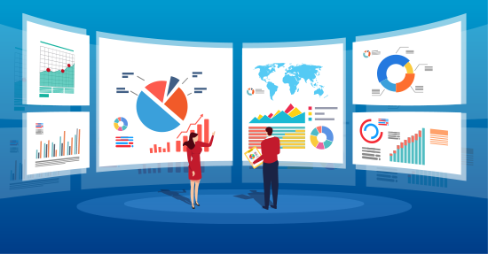
What is graphic reporting?
 Graphic reporting refers to the practice of conveying information or telling a story through visual elements, such as charts, infographics, maps, illustrations, and other graphic elements. It is a form of visual journalism that combines data, storytelling, and visual design to present complex information in a visually appealing and accessible way.
Graphic reporting can be used in various contexts, such as news reporting, business reporting, scientific reporting, and educational materials. It often involves the use of visual aids to enhance understanding, clarify complex concepts, and communicate information more effectively.
Graphic reporting can take many forms, including:
- Data visualization: Using charts, graphs, and other visual representations to display data and convey complex information in a concise and visually appealing manner.
- Infographics: Using a combination of text, icons, illustrations, and other visual elements to present information, facts, and statistics in a visually appealing and easy-to-understand format.
- Illustrated journalism: Using illustrations, sketches, or cartoons to report news, events, or stories in a visually engaging and creative way.
- Maps and diagrams: Using maps, diagrams, and schematics to illustrate spatial relationships, processes, or concepts.
- Comics journalism: Using the sequential art form of comics or graphic novels to report news, events, or stories in a narrative format with visual elements.
Graphic reporting can help make complex information more accessible and engaging for readers or viewers, and it is often used to supplement or enhance traditional text-based reporting. It is an effective tool for visual storytelling and can be found in various media platforms, including print publications, websites, social media, and multimedia presentations.
What is the purpose of using graphic representation in reports?
 Graphic representations, such as charts, graphs, diagrams, and other visual elements, are commonly used in reports for several purposes:
- Data visualization: Graphics are used to visually represent data, making it easier to understand complex information at a glance. By presenting data in a visual format, graphics can help readers quickly interpret and analyze data, identify patterns, trends, and relationships, and draw insights from the information presented.
- Communication and clarity: Graphics can enhance communication and improve the clarity of the information being presented in a report. Visual representations can make information more accessible and understandable to a wide range of audiences, including those who may not be as familiar with the subject matter or who prefer visual learning.
- Conciseness and efficiency: Graphics can convey information more concisely and efficiently than text. Instead of using lengthy descriptions or explanations, a well-designed graphic can effectively summarize complex information, saving space and improving the overall readability of the report.
- Persuasion and impact: Graphics can be used to persuade and influence readers by presenting data and information in a visually compelling way. Well-designed graphics can help highlight key findings, emphasize important points, and make a stronger impact on readers, increasing the overall effectiveness of the report in conveying its message.
- Aesthetics and professionalism: Graphics can enhance the overall aesthetics and professionalism of a report. Well-designed graphics can add visual appeal to the report, making it visually appealing and engaging. Professional-looking graphics can also lend credibility to the report, showcasing a high level of expertise and attention to detail.
In summary, the purpose of using graphic representation in reports is to improve data visualization, enhance communication and clarity, achieve conciseness and efficiency, persuade and impact readers, and improve the aesthetics and professionalism of the report.
What is the most frequently used graphic in a report?
:max_bytes(150000):strip_icc()/examples-of-graphic-organizers-2162277-v1-278fa4e4b27c41d9a8515d079ee4efd1.png) Based on general knowledge, the most frequently used graphics in a report can vary depending on the type of report and the information being presented. Some commonly used graphics in reports include:
Based on general knowledge, the most frequently used graphics in a report can vary depending on the type of report and the information being presented. Some commonly used graphics in reports include:
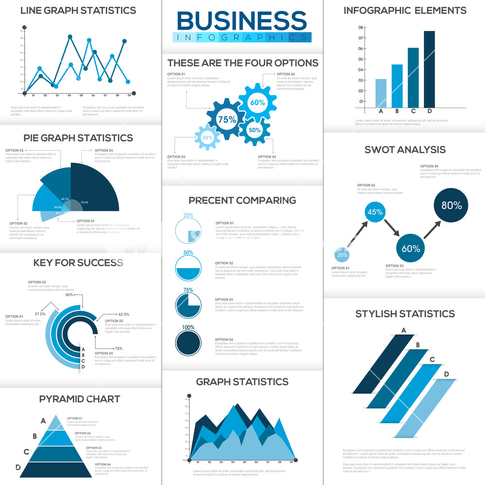
- Bar charts: These are used to display categorical data in rectangular bars, with the length of the bars representing the quantity or value of the data.
- Line charts: These are used to display data over time, showing trends or patterns. They use lines to connect data points, which represent the values of the data.
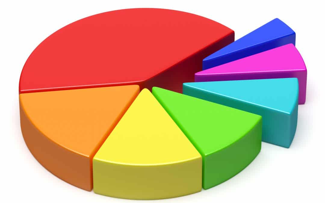
- Pie charts: These are used to display proportions or percentages of a whole. They are circular charts divided into slices, with each slice representing a portion of the whole.
- Tables: These are used to display data in a tabular format, with rows and columns. Tables can be used to present a wide range of data types, including numerical data, text, and qualitative data.
- Scatter plots: These are used to display relationships between two variables. Scatter plots use dots on a graph, where the position of each dot represents the values of the two variables being compared.
- Infographics: These are visual representations that combine text, images, and graphics to convey complex information in a visually appealing and easily understandable way. Infographics can include various types of graphics, such as charts, diagrams, and illustrations.
The most frequently used graphic in a report will depend on the nature of the report, the data being presented, and the preferences of the report creator and audience. It’s important to choose the appropriate graphic that effectively communicates the information you want to convey in your report.
 What is a graphic chart
A graphic chart, also known as a chart or graph, is a visual representation of data or information. It typically presents data in a graphical format, such as a line chart, bar chart, pie chart, or scatter plot, to display relationships, trends, or comparisons between data points. Graphic charts are commonly used in various fields, including business, science, statistics, economics, and education, to convey complex information in a clear and organized manner. They can be created using software tools such as Microsoft Excel, Google Sheets, or specialized data visualization software, and are widely used for data analysis, reporting, and decision-making purposes.
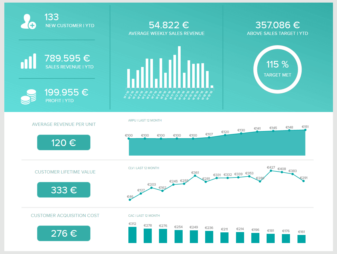
Using graphics in business reports
 Graphics can be a powerful tool in business reports to help convey complex information in a visually appealing and easy-to-understand manner. Here are some tips on how to effectively use graphics in your business reports:
- Choose the right type of graphic: There are various types of graphics to choose from, including bar charts, line charts, pie charts, scatter plots, and more. Consider the type of data you are presenting and the message you want to convey, and choose the appropriate graphic that best represents the information.
- Keep it simple: Avoid cluttering your graphics with too much information or too many data points. Keep it simple and focused, highlighting the key information you want to convey. Use clear labels, titles, and legends to help readers understand the content of the graphic quickly.
- Use meaningful visuals: Select visuals that are meaningful and relevant to your data. Avoid using unnecessary and distracting visuals that do not add value to your message. Choose colors, fonts, and styles that are consistent with your overall report design and branding.
- Provide context: Graphics should be accompanied by context to help readers interpret the data accurately. Include explanations, interpretations, and conclusions that provide meaningful insights and help readers understand the implications of the data presented.
- Ensure accuracy: Ensure that your graphics accurately represent the data and avoid distorting or misrepresenting information. Use accurate data sources, clearly indicate the time period and units of measurement, and label your axes appropriately.
- Use appropriate scale: Use an appropriate scale for your graphics to ensure that the data is represented accurately. Avoid distorting the data by using disproportionate scales or omitting relevant data points.
- Label clearly: Clearly label your graphics with titles, legends, and captions that provide a clear explanation of the information being presented. Avoid ambiguous labels that may confuse readers.
- Visualize trends and patterns: Graphics can be used to visually represent trends, patterns, and comparisons in the data. Use graphics to highlight key insights and trends that are relevant to your report’s objectives.
- Test for readability: Before including graphics in your final report, test for readability. Ask others to review your graphics and provide feedback to ensure that they are easy to understand and convey your intended message effectively.
In conclusion, graphics can be a valuable tool in business reports to convey complex information in an accessible and visually appealing way. By following these tips, you can effectively use graphics to enhance your business reports and communicate your message clearly and effectively.
Graphic design report pdf
 Here is an example of a structure for a graphic design report:
- Title Page: Include the title of the report, the name of the designer or design team, the date, and any relevant logos or images.
- Table of Contents: List the sections or chapters of the report with page numbers for easy navigation.
- Executive Summary: Provide a brief overview of the report, including the purpose, scope, and key findings or recommendations.
- Introduction: Introduce the topic of the report and provide background information on the project or design brief.
- Design Process: Describe the steps taken in the design process, including research, concept development, design iterations, and final design choices. Include any visual representations such as sketches or mood boards.
- Design Elements and Principles: Discuss the use of design elements such as color, typography, imagery, and layout, and how they were applied in the design project. Explain how design principles such as balance, contrast, unity, and hierarchy were considered.
- Design Evaluation: Evaluate the effectiveness of the design project in meeting its objectives and target audience. Use qualitative and/or quantitative data, such as user feedback or performance metrics, to support your evaluation.
- Challenges and Solutions: Discuss any challenges or obstacles faced during the design process and the solutions implemented to overcome them.
- Conclusion: Summarize the main points of the report and provide final thoughts or recommendations.
- References: Include a list of any sources or references used in the report, such as books, articles, or websites.
- Appendices: Include any additional materials that support the report, such as design sketches, mockups, or sample images.
Remember to use appropriate headings, subheadings, and formatting to make the report visually appealing and easy to read. Once you have written the content of your report, you can use a PDF conversion tool or software to convert it into a PDF format for sharing or printing.
Graphic Report: Frequently Asked Questions
How do Graphic Reports enhance data communication? Graphic Reports transcend traditional data presentations by visually communicating complex information. Through effective visualizations, they simplify understanding and aid decision-making processes.
Can I create Graphic Reports without graphic design skills? Absolutely! Various user-friendly tools are available to help individuals create Graphic Reports without extensive graphic design knowledge. These tools offer templates and easy-to-use features for a seamless experience.
What are the key elements to consider when designing a Graphic Report? Consider factors like audience, purpose, and the type of data when designing Graphic Reports. Choose appropriate visual elements, maintain simplicity, and ensure clarity in conveying your message.
Are Graphic Reports more effective than traditional reports? Yes, Graphic Reports are often more effective as they engage viewers and convey information quickly. Visual elements enhance retention and understanding, making Graphic Reports a powerful communication tool.
How can businesses leverage Graphic Reports for marketing purposes? Businesses can use Graphic Reports to showcase performance metrics, customer feedback, and market trends. Visualizing data makes marketing materials more compelling, aiding in effective communication with clients and stakeholders.
What role do Graphic Reports play in academic research? In academic research, Graphic Reports simplify the presentation of complex findings. Researchers use visuals to illustrate data trends, making their work more accessible to peers, educators, and the general public.
Conclusion
In conclusion, the Graphic Report emerges as a beacon of effective communication, weaving together data and design seamlessly. Whether you’re aiming to captivate your audience, enhance learning, or make informed decisions, Graphic Reports stand as invaluable tools. Embrace the power of visual narratives and elevate your communication to new heights.