
Unless you’ve been living under a rock your entire life, you’ve definitely been handed your fair share of brochures. Whether you’re trying to drive traffic into a new gym location, showcase a property for sale or get the word out about your business, brochures are powerful and effective tools for engaging and educating any audience. But only if your brochure design is on point.
When it comes to brochures, it’s all about the design. A great design will compel your audience to read all about what you’re doing. A less-than-stellar design will end up in the trash can.
So how, exactly, do you design an awesome brochure? Never fear, we’ve got the ultimate guide to brochure design. By the end of this post, you’ll have everything you need to create, design, and print a great brochure that drives results and makes a lasting impact on your target audience.
How to design a brochure
—
Before you start brochure designing service
Know your brand personality
Define your ideal customer
Develop your message
Determine your metrics for success
Set your budget
Designing your brochure
Remember your brand design standards:
- Choose your brochure type
- Gather your copy and images
- Find your style
- Pick the perfect CTA
- Evaluating and printing
- Evaluate your design
- Choose a printer
- Explore print options
Before you start designing your brochure
—
The key to creating an amazing page brochure design cost actually starts before you design. When you do the legwork before you start designing—by knowing your brand personality, message, and target customer—you’ll make the design process go a lot more smoothly.
Know your brand personality
Do you know who you are? Knowing your brand personality is a must. If you don’t know your brand inside and out, all of your branding materials—including your brochures—will feel disjointed and unclear.

For more on how to define your brand personality, check out our in-depth guides on:
Corporate identity
Personal branding
Developing an identity for entrepreneurs
Define your ideal customer
Before you start designing your brochure, get crystal clear on who you’re designing for. Different audiences require different designs, and if you’re not clear on your audience, you run the risk of making the wrong design choices.

Ask yourself:
- Who is my ideal customer?
- What kind of information are they looking for?
- Are they more likely to respond to more images or more text?
- What kind of copy do they expect? (i.e. Corporate or conversational? Humorous or serious?)
What can I do to best grab their attention?
When you know who you’re designing for, use that to steer your design decisions. You’ll end up with a brochure that feels true to them, which will help up your chances of success.
Develop your message
Want to learn how to create the perfect brochure for your brand?
We touched on this above, but before you design your brochure, it’s so, so important that you define your message.
You need to know what you’re going to say in your brochure and how you’re going to say it before you even think about getting a design in place. Because your message is the most important thing. It all comes back to knowing your customer. If you don’t have a strong, clear message that speaks to them in language and images they can relate to, it doesn’t matter what design you come up with. Your brochure will fall flat.

For example, let’s say you were designing a brochure for new parents to advertise your children’s gym. Your message might be: “We’re fun and friendly—come join us!” So you want to use accessible, simple, friendly language and bright, vibrant imagery to match your brand and appeal to your target audience. Using complex language likely wouldn’t make sense to your customers.
On the flip side, if you’re designing a brochure to advertise your services as a financial advisor, your message will likely be quite different, so using simple language and bright imagery could feel too childish, and your ideal client wouldn’t take your message seriously.
Determine your metrics for success
Having metrics in place should be a non-negotiable for every brochure you design. Without metrics, you’ll have no idea if you should keep rolling with the same design for future brochures, or if you need to totally overhaul things to drive more results.
Before you design, determine your metrics by defining what you’re hoping to get out of your brochure. Here are a few ideas:
-
Are you looking to drive people into a retail location? Include a coupon or voucher and measure how many of them are redeemed at your store.
-
Are you trying to drive people to your website? Include a custom URL on the pamphlet and track the number of visitors during the campaign.
-
Are you trying to build buzz around a new product launch? Include a CTA to sign up for your email list to get updates and see how large your list grows during the campaign.
Set your budget
Your budget is more than just knowing how many brochures you can print. It determines everything from your type of paper to the fun printing techniques you can use to jazz up your brochure.
Come up with a budget-per-print and start making some decisions based on what’s most important. Do you need your brochures to be extra sturdy? Invest in a thicker paper. Do you have a cool idea on how to illustrate one of your points? Look at more expensive ink options and printing techniques to bring your visuals to life.
Designing your brochure
—
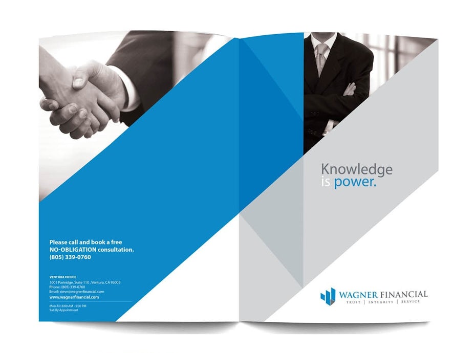
Remember your brand identity
As you’re starting the brochure designing services process, keep your brand identity front of mind. These elements describe the visual look and feel of your brand, and no matter what kind of brochure you’re designing, it needs to be consistent with your overall branding.
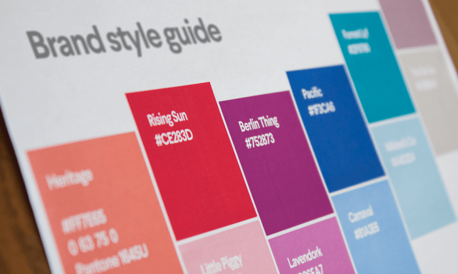
Choose design elements (colors, fonts, and images) that match your personality and the tone and content of your brochure. If you’ve already set your brand color and fonts, make sure you carry them over into your brochure design.
Design with the reader in mind
As a business owner or designer, it’s easy to get caught up in what you want. But, real talk? What you want doesn’t actually matter. It’s what your customer wants that counts.
When you’re designing your layout, keep your reader in mind. How would your ideal customer want to receive information? Are they OK with big blocks of text, or do they need things to be broken up with images so they don’t feel overwhelmed? Are their specific colors or fonts that would be particularly appealing to them? Where can you put all of your information (like your business name and contact information) so it’s easier for them to find?
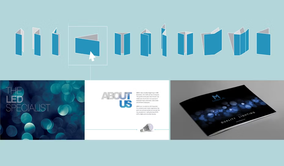
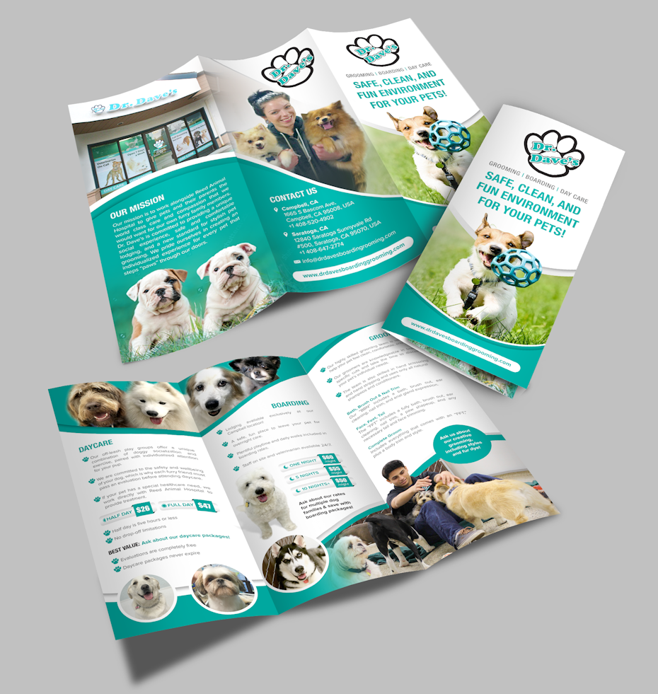
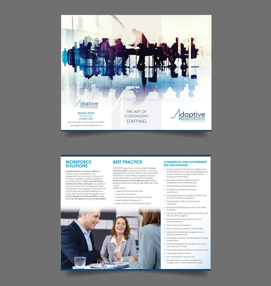
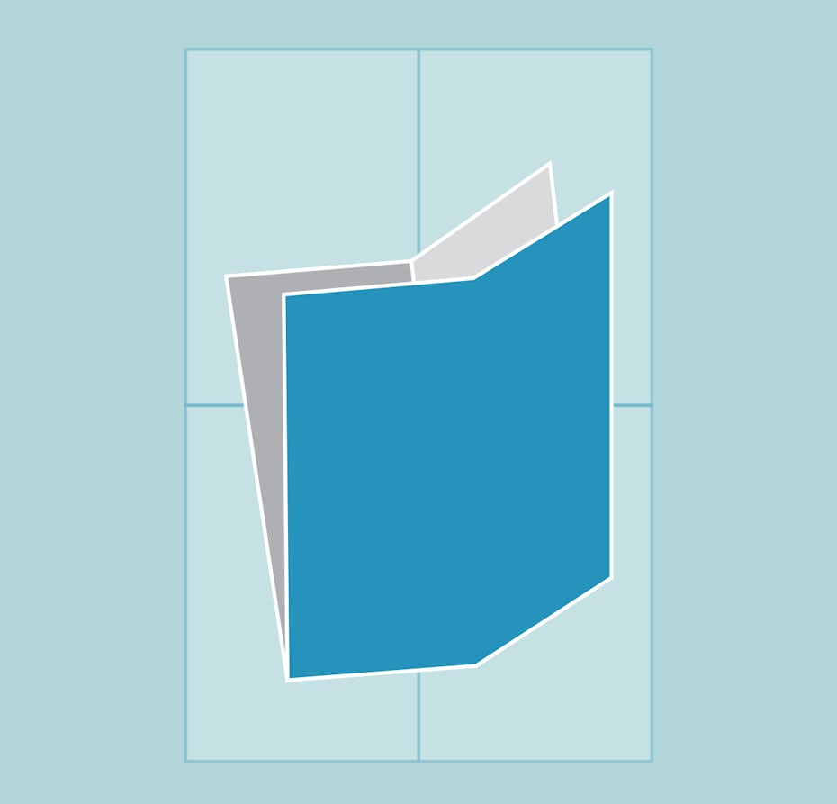
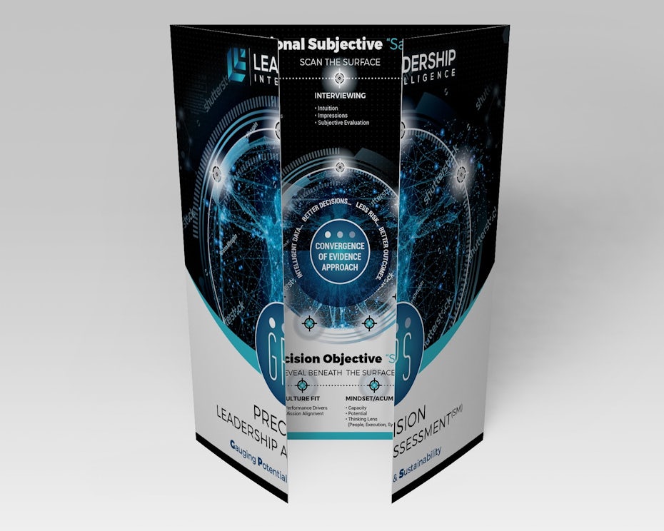
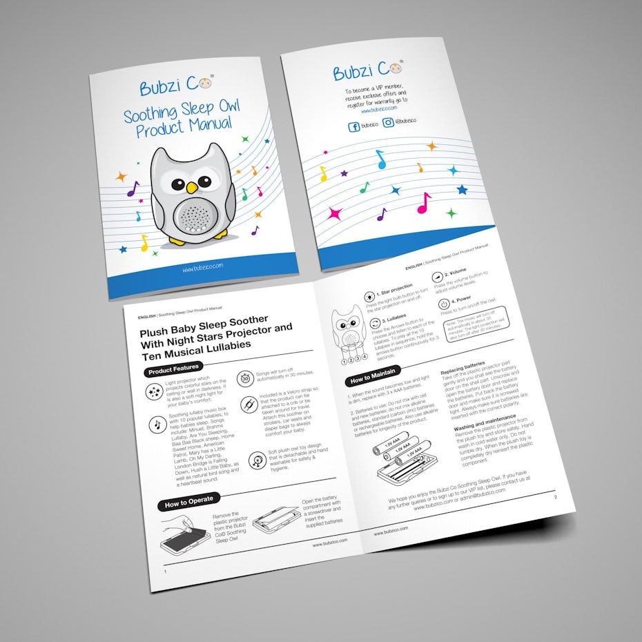
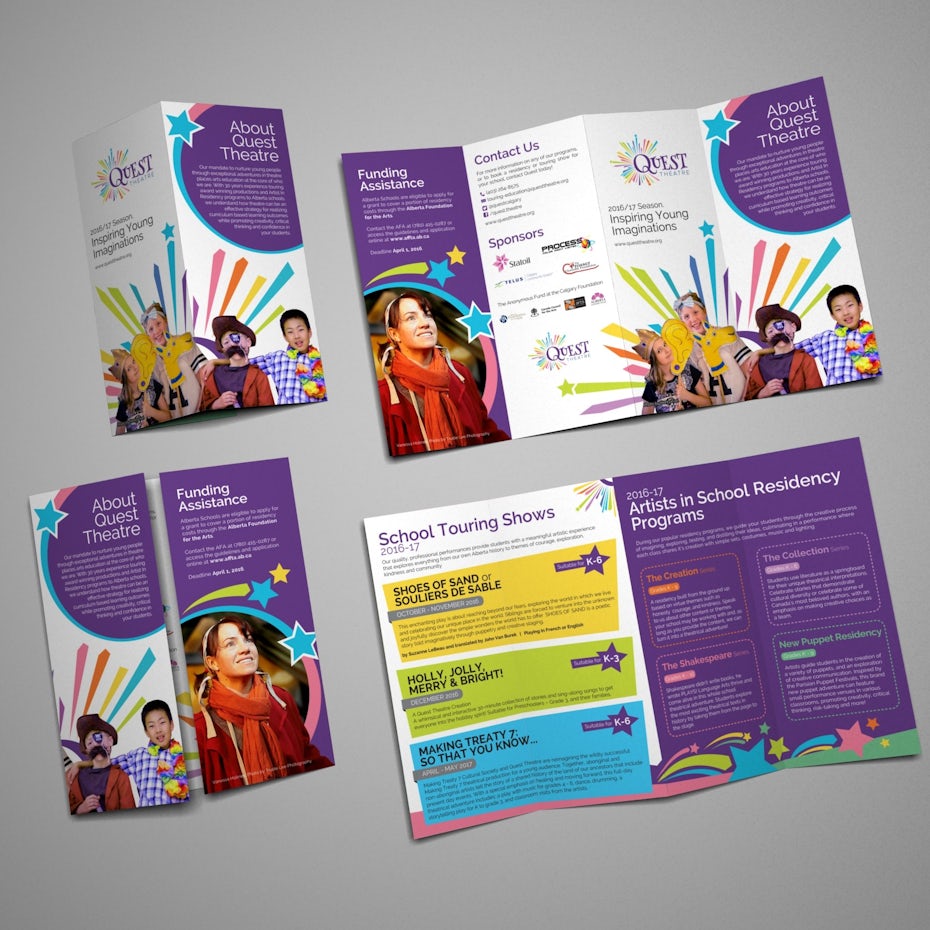
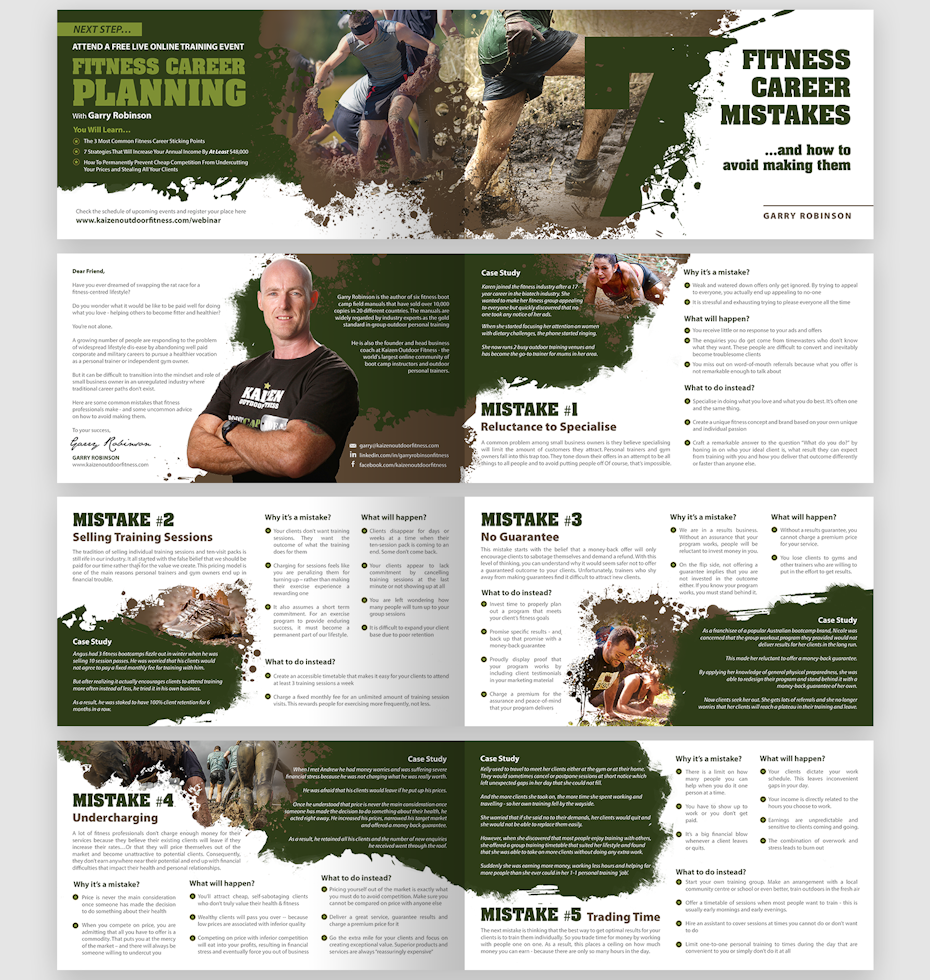
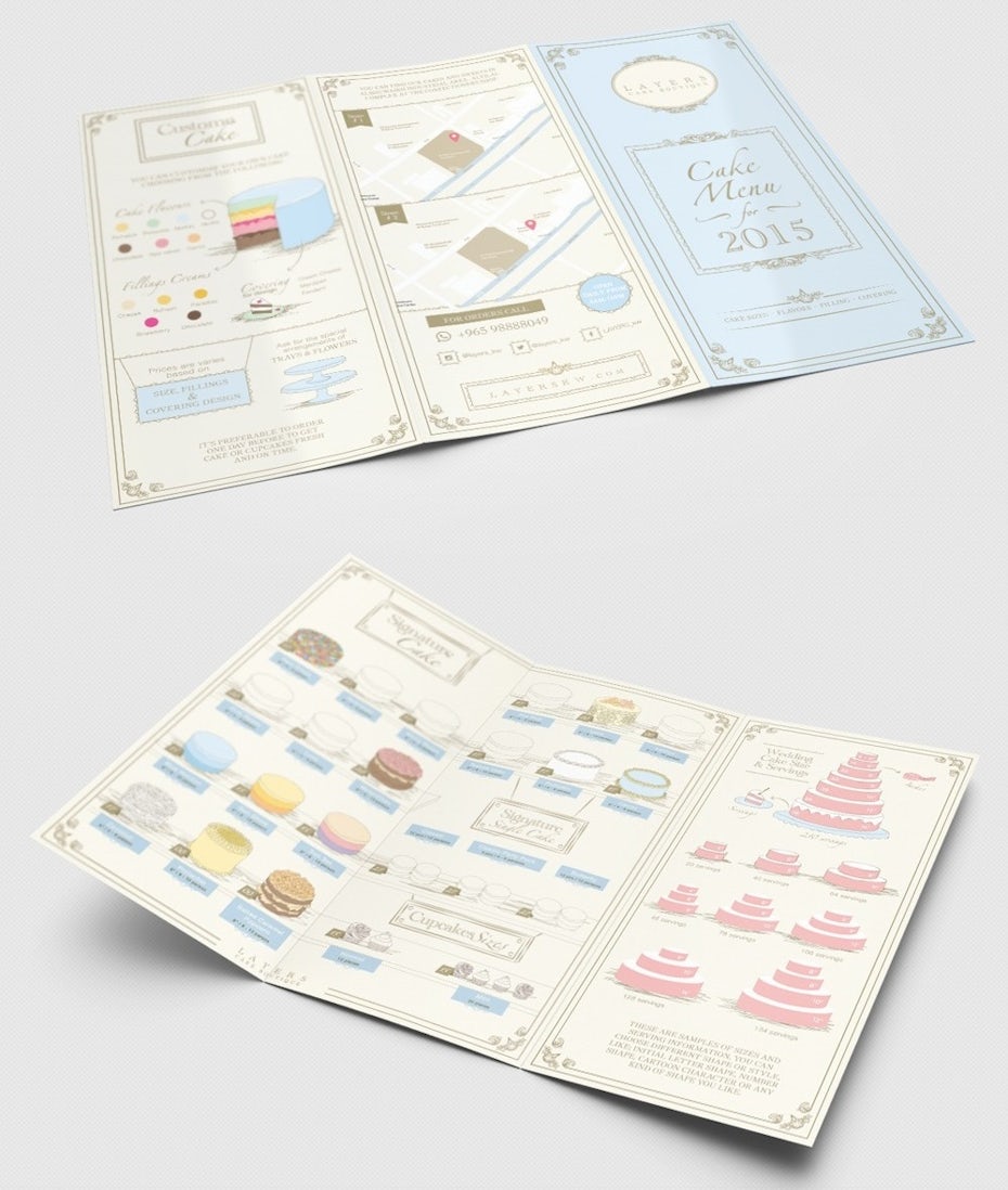
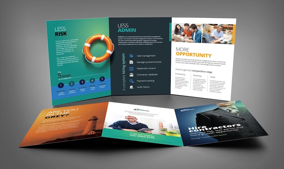
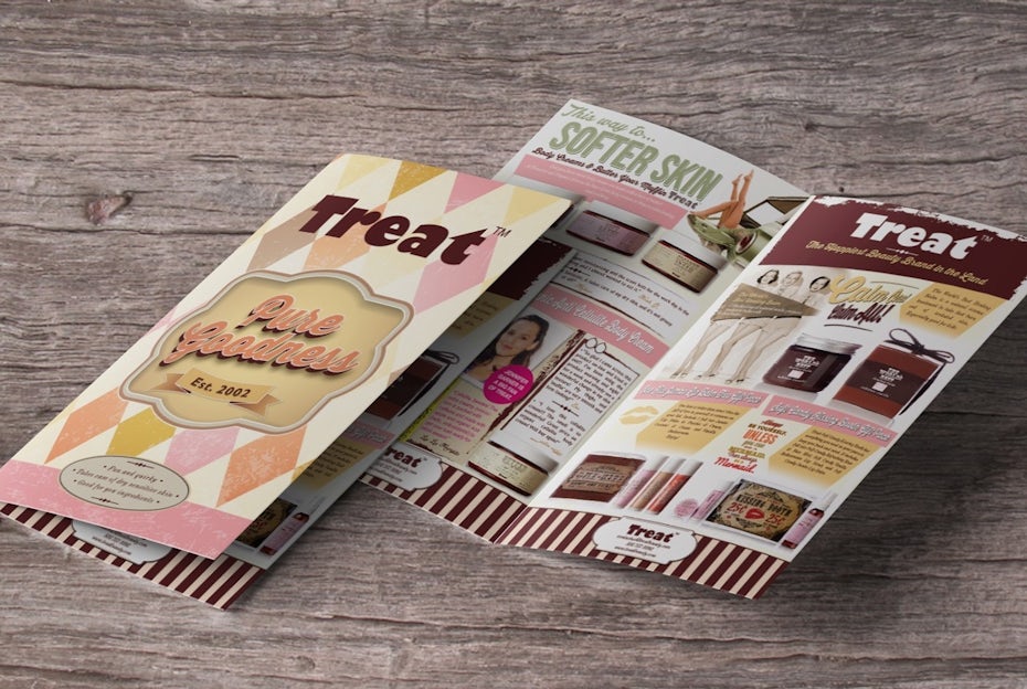
Choose your brochure type
You might think “Well, isn’t there just one brochure type… you know, like a brochure?” And the answer is no. There’s a laundry list of options when it comes to choosing your brochure type and the way it’s folded.
There’s a whopping 15 ways you can fold your brochure. They include:

Tri-fold

Z-fold

Parallel fold

Roll fold

Accordion fold
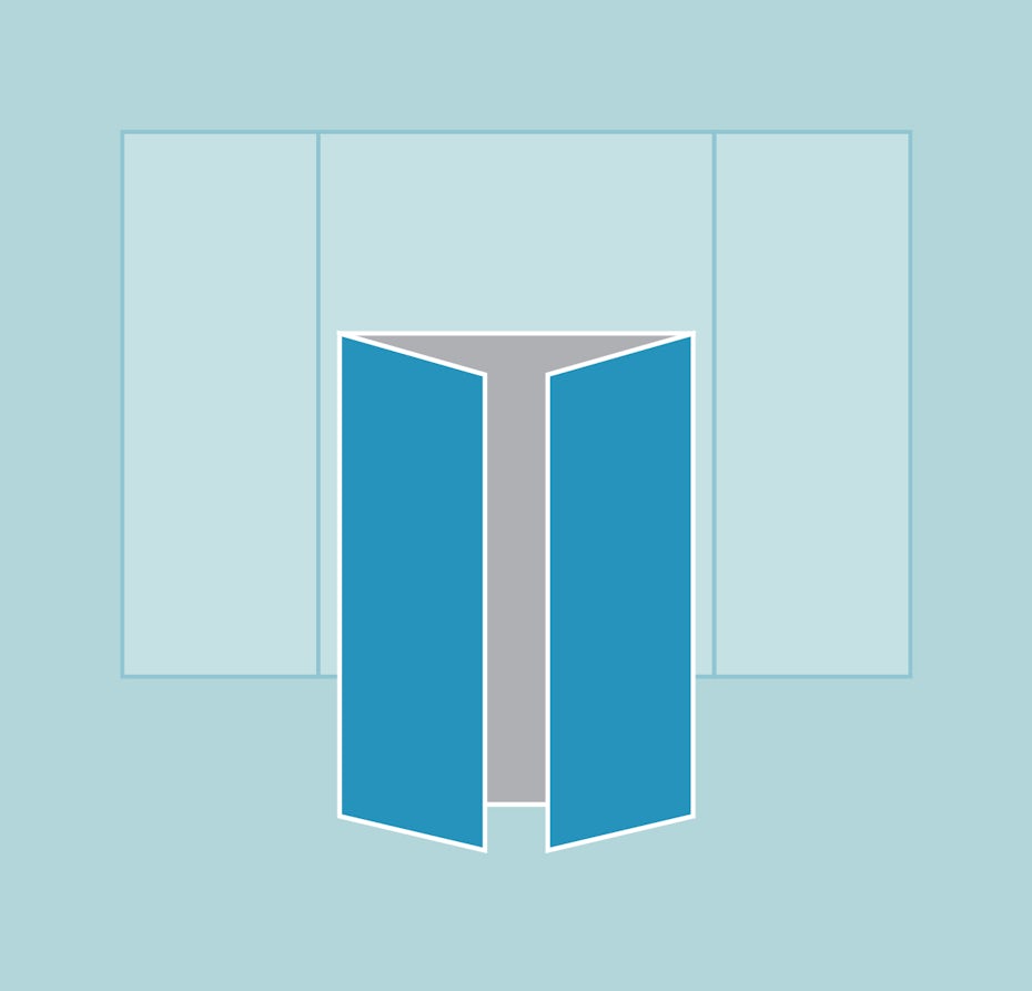
Single gate fold

Double gate fold
Half + half fold

Half + tri-fold

Half-fold

Half-fold (letter)
The brochure type that’s right for your brochure design is 100% going to depend on the content.
You might keep it simple with a Classic Tri-Fold. If you’ve got a ton of information you need to communicate, go for an option that has more space, like an Eight-Panel Roll Fold or a 16-Panel Fold. If you’re doing a step-by-step product tutorial, use a Four-Panel Roll Fold to make your content easy to follow for readers.


Also consider how your brochure is ultimately going to be delivered.
Are you going to put the brochures on a rack? Are you going to stuff them in a bag with other promotional goodies? Are you going to send them as a mailer? How you plan to deliver or display your brochures will go a long way in determining which fold is the best choice for you and your business.
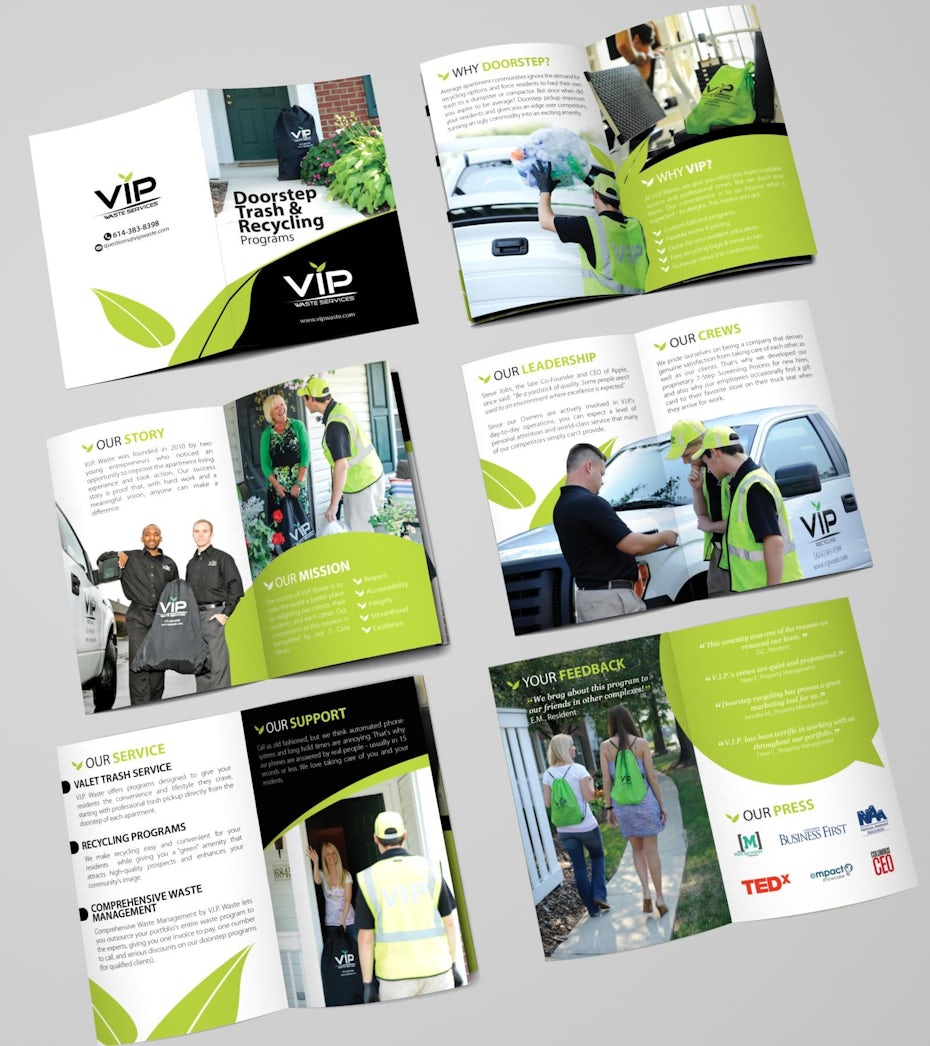
Gather your copy and images
Have your copy and images ready to go before you start putting pen to paper and creating a design. This will help you make important decisions about layout, length, font size, and more.
Start with your ideal amount of copy. Including a lot of copy in your design can deliver a lot of information for your readers. However, those huge text blocks can feel overwhelming and actually discourage them from reading. Shoot for something in the middle.

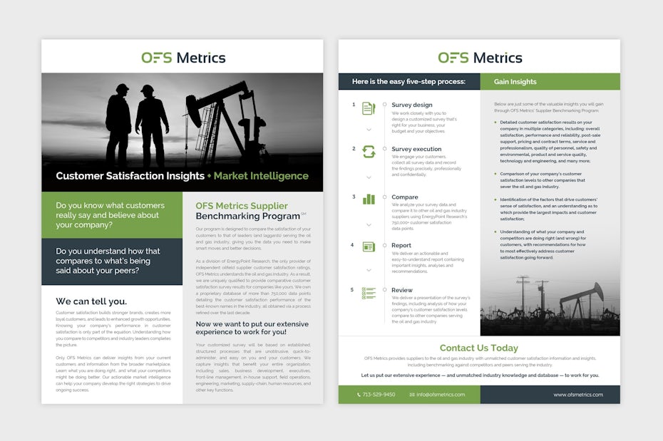
Then, do the same with your images. Gather them all in front of you and figure out which ones will help tell your story and where they should be placed. Your images are the first things people will see, so they should help you connect with your reader and illustrate what you do.
Find your style
When all is said and done, it’s the stylistic elements that are really going to make your brochure shine.
Keep it clean and simple
Graphics! 3D Elements! Glitter! ALL THE TEXT!
If your brochure has too much going on design-wise, it’s going to feel totally overwhelming to your reader. You don’t want to overcrowd your brochure design with too much text, too many graphics, or too many different design elements that compete for your reader’s attention. Keep your design clean, simple, and easy-to-digest for the best results.
Think outside of the box
Stock brochure design… It can be a major yawn.
Consumers these days are savvy. They don’t want a bunch of the same old, same old. So if you want your brochure to make an impact on your audience, it can’t look like every other brochure they’ve had in their hands for the past 10 years.
Focal point = your CTA
The reason you’re designing your brochure in the first place is to encourage your readers to take action. And if you want them to take action, you need to tell them in a big way.
If your CTA is buried in a mountain of text in the last paragraph on the last page of your brochure, guess what? No one’s going to see it. If you want your CTA to actually inspire people to take action, make it big, bold, and impossible for them to miss.

Give your CTA center stage. Put it in multiple places on your brochure. Make it so that no matter how far into your brochure they read, they won’t miss your CTA. Because the more front-and-center you put your CTA, the more people will actually take action.
Evaluating and printing your brochure
—
Your brochure is designed and you’re almost ready to roll it out to the masses. But first, make sure it’s perfect.
Evaluate your design for brochure template
Once your brochure is designed, take your time to evaluate the final product. Now is your last chance to make changes and get your design right.
Want to learn how to create the perfect brochure for your brand?
-
Does this design grab my attention?
-
Is my messaging clear?
-
Does this design point to my CTA?
-
Is this brochure in line with my branding?
Ask other people those same questions to get an outside perspective. Show your design to your colleagues, customers, even friends to figure out if you’ve got a winner. Once you’re happy, it’s time to get printing!
Choose your printer
Working with a top-notch printer can mean the difference between your brochure design coming to life exactly as you imagined it… Or turning out like some gnarly, bootleg version.
When you’re researching printers, ask them questions to see if they’re going to be the best fit for your job. Here are a few examples:
-
What are your ink options?
-
What is your best printing option for time? For cost?
-
Do you do color matching?
-
Do you offer printed or digital proofs?
-
What happens if I’m not satisfied with my print job?
-
Do you have designers in-house?
-
Do you have experience in brochure printing and design?
-
Can you provide references for other brochure clients?
Ideally, find a printer who has experience in the brochure space, uses the latest print technology and has designers on staff who can help with any design issues so your print job comes out looking A+.
Choose your print materials for brochure templates
Work with your printer to select the best materials for your brochure. Here’s a little cheat sheet to help you on your way:
Paper weight
Generally speaking, the higher the paper weight, the thicker the sheet. There are a few different ways to measure paper weight (like basis weight and mils), but the most common is metric weight, also known as GSM. The GSM is the weight of one sheet of paper cut into a 1×1 meter square.
Finish
Once you’ve chosen your paper, it’s time to choose your finish. There are a few different types of finishes to choose from:
Matte: A completely flat finish without any shine
Semi-Gloss: A somewhat shiny finish that falls between matte and glossy
Glossy: A shiny, reflective finish
Ink and speciality processes
Some printers also offer specialty inks that can enhance your brochure. Here are a few options you can inquire about:
Foil: A shiny, metallic ink or stamp that reflects light
Embossing: The process of pressing a shape or image into paper to create a raised effect
Folding things up (yes, that’s definitely a brochure design pun)
—
You now have everything you need to get out there and design an incredible brochure. One that will deliver your brand message, inspire your customers to take action, and bring you closer to your goals—one brochure at a time.
In today’s fast-paced business environment, where digital marketing dominates, one might wonder about the relevance of traditional marketing tools. However, the truth is that certain classic approaches, like well-crafted brochures, remain indispensable. A carefully designed brochure has the power to capture attention, convey information effectively, and leave a lasting impression on your target audience.
I. Introduction
A. Importance of Brochures
Brochures serve as tangible, versatile marketing tools that allow businesses to showcase their products or services in a visually appealing format. Despite the rise of online marketing, a well-designed brochure can provide a tactile and memorable experience for potential customers.
B. Purpose of Brochure Design
The primary goal of brochure design is to communicate key messages in a compelling and concise manner. Whether used for product launches, events, or general brand promotion, a brochure acts as a tangible representation of your business.
II. Understanding the Target Audience
A. Defining Target Demographics
Before diving into the design process, it’s crucial to understand who your target audience is. Consider demographics such as age, gender, and location to tailor your brochure to their preferences.
B. Analyzing Audience Preferences
Researching your audience’s preferences helps in making design decisions, from color choices to content layout. Aligning with their tastes ensures that your brochure resonates effectively.
III. Key Elements of Effective Brochure Design
A. Captivating Cover Design
The cover is the first point of contact. A captivating design should grab attention and provide a glimpse of what’s inside, enticing the reader to explore further.
B. Compelling Content Layout
Organizing content in a clear and logical manner enhances readability. Use headlines, subheadings, and bullet points to guide the reader through the information.
C. High-Quality Imagery
Images speak louder than words. Including high-quality visuals relevant to your message enhances the overall impact of your brochure.
D. Call-to-Action Strategies
Every brochure should prompt the reader to take action. Whether it’s visiting a website, making a call, or attending an event, a clear call-to-action encourages engagement.
IV. Choosing the Right Format and Size
A. Single vs. Multi-Page Brochures
Decide on the brochure format based on the amount of information you need to convey. Single-page brochures are concise, while multi-page brochures allow for in-depth exploration.
B. Standard Sizes and Customization Options
Selecting the right size is crucial for practicality and aesthetics. Consider industry standards while exploring customization options for a unique touch.
V. Color Psychology in Brochure Design
A. Impact of Colors on Consumer Perception
Colors evoke emotions and influence perceptions. Understanding color psychology helps in choosing a palette that aligns with your brand and resonates with your audience.
B. Choosing a Color Scheme
Harmonize colors in your brochure to create a visually pleasing and cohesive design. Balance vibrant tones with neutrals for readability.
VI. Typography and Font Selection
A. Readability Considerations
Choose fonts that are easy to read, especially when dealing with smaller text. Consider the hierarchy of text elements for a structured layout.
B. Font Pairing Tips
Pairing fonts adds variety and visual interest. However, ensure that the combination enhances readability rather than causing confusion.
VII. Incorporating Brand Identity
A. Logo Placement and Sizing
Your logo is a key brand identifier. Place it strategically on the brochure and ensure it aligns with the overall design without overpowering other elements.
B. Consistent Branding Elements
Maintain consistency in fonts, colors, and imagery across all marketing materials. A cohesive brand identity builds recognition and trust.
VIII. Utilizing White Space Effectively
A. Balancing Content and Empty Spaces
White space, or negative space, is crucial for preventing visual clutter. Use it strategically to guide the reader’s focus and enhance overall aesthetics.
B. Enhancing Visual Appeal
Well-utilized white space not only improves readability but also contributes to the overall visual appeal of the brochure.
IX. Printing and Paper Selection
A. Sustainable Printing Practices
Consider eco-friendly printing options to align with modern sustainability values. Choose paper that complements the design and adds a tactile element.
B. Paper Quality and Texture Choices
The choice of paper quality and texture can significantly impact how the brochure feels in hand. Select options that enhance the overall sensory experience.
X. Brochure Design Software and Tools
A. Popular Design Software
Proficiency in design software is essential for creating a professional-looking brochure. Familiarize yourself with popular tools like Adobe InDesign, Canva, or Microsoft Publisher.
B. Online Tools for Non-Designers
For those without design expertise, online tools offer user-friendly interfaces and templates for creating polished brochures with minimal effort.
XI. Testing and Revising the Brochure
A. Gathering Feedback
Before finalizing your design, gather feedback from colleagues or target audience members. Use constructive criticism to refine and improve your brochure.
B. Iterative Design Process
FAQs – Designing a Brochure
Q: What is the ideal length for a brochure? A: The ideal length depends on your content and format. However, concise brochures with focused information often perform better. Aim for a length that engages without overwhelming.
Q: How can I choose the right color palette for my brochure? A: Consider your brand colors, the emotions you want to evoke, and the preferences of your target audience. Harmonize colors to create a visually appealing and cohesive design.
Q: Is professional photography necessary for a brochure? A: While professional photography adds a polished touch, high-quality stock images can also be effective. Choose visuals that align with your brand and message.
Q: What makes an effective call-to-action in a brochure? A: An effective call-to-action is clear, concise, and prompts a specific action. Whether it’s visiting a website, making a purchase, or attending an event, guide your reader with precision.
Q: How can I balance simplicity and complexity in brochure design? A: Strategic use of white space, clear typography, and a well-thought-out layout contribute to a balanced design. Prioritize key information and avoid visual clutter.
Q: Should I design my brochure differently for print and digital formats? A: Yes, consider the medium. Digital brochures can include interactive elements, while print versions require attention to print quality and texture.
Conclusion
Designing a brochure is a blend of art, strategy, and effective communication. From understanding your audience to the final distribution, each step plays a crucial role in creating a brochure that captivates and leaves a lasting impression. Embrace creativity, stay true to your brand, and let your brochure tell a compelling story.