Purpose of table of contents
A well-organized and clearly labeled brochure table of contents can make it easier for readers to find the information they are looking for, especially in longer brochures that cover multiple topics or sections. By providing an overview of the brochure’s contents, the table of contents can also help readers determine whether the brochure is relevant to their needs and interests.
Overall, the table of contents serves as a helpful tool for both the brochure creator and the reader, ensuring that the brochure is well-structured and easy to use.
Why is a table of contents important
The number of pages in a brochure can vary depending on the design, purpose, and content of the brochure. Brochures typically range from a single sheet of paper folded in half to multiple pages. The most common types of brochures are bi-fold (four pages), tri-fold (six pages), and z-fold (six panels). However, brochures can have more pages if they include additional folds or inserts. Some brochures can be as short as two pages or as long as 20 pages or more, depending on the amount of information and the desired layout. Ultimately, the number of pages in a brochure is determined by the specific requirements and objectives of the project.A table of contents is an essential component of a document, particularly in books, reports, and other lengthy written works. It serves several important purposes:
Navigation: A table of contents provides readers with an organized overview of the document’s structure and content. It helps them quickly locate specific sections or chapters, allowing for efficient navigation through the material. Instead of scrolling or flipping through pages randomly, readers can refer to the table of contents to find the information they need.
Information retrieval: When readers are searching for specific information within a document, a table of contents can be immensely helpful. By listing the main sections and subsections, it enables users to identify the relevant parts and jump directly to them. This saves time and effort, especially when dealing with extensive texts.
Structure and organization: A table of contents gives a clear outline of the document’s structure, presenting an organized hierarchy of topics and subtopics. It helps readers understand how the content is organized and how different sections relate to each other. This structural overview improves comprehension and facilitates the absorption of information.
Overview and preview: The table of contents serves as a preview or summary of the document’s content. It allows readers to get a sense of the topics covered, the order in which they appear, and the relative importance or length of each section. This overview helps readers decide which parts are most relevant to their interests or needs.
Reference and citation: In academic and research contexts, a table of contents aids in proper referencing and citation of specific sections. By providing clear labels and page numbers for each section, it becomes easier for readers to refer to or cite specific information when citing sources or writing scholarly papers.
Overall, a table of contents enhances the usability and accessibility of a document by providing structure, navigation, and a quick overview of the content. It improves reader experience, saves time, and facilitates effective information retrieval.
How many pages are there in a brochure
The number of pages in a brochure can vary depending on the design, purpose, and content of the brochure. Brochures typically range from a single sheet of paper folded in half to multiple pages. The most common types of brochures are bi-fold (four pages), tri-fold (six pages), and z-fold (six panels). However, brochures can have more pages if they include additional folds or inserts. Some brochures can be as short as two pages or as long as 20 pages or more, depending on the amount of information and the desired layout. Ultimately, the number of pages in a brochure is determined by the specific requirements and objectives of the project.
Brand guidelines tables of content
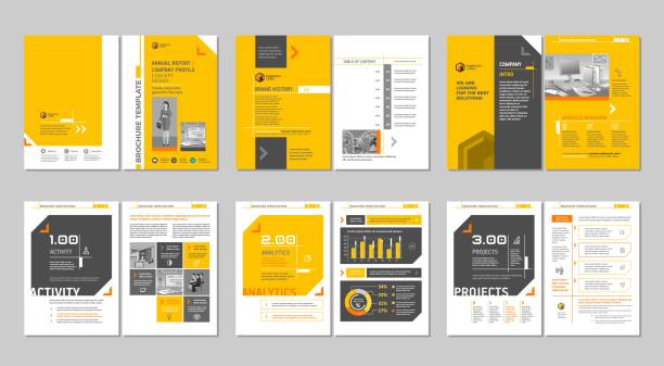
Table of Contents for Brand Guidelines:
Introduction
1.1. Brand Overview
1.2. Purpose of the Brand Guidelines
1.3. Target Audience
1.4. Importance of Consistent Branding
Brand Identity
2.1. Brand Name and Logo
2.1.1. Logo Usage
2.1.2. Logo Variations
2.2. Color Palette
2.2.1. Primary Colors
2.2.2. Secondary Colors
2.2.3. Color Combinations
2.3. Typography
2.3.1. Typeface Selection
2.3.2. Font Sizes and Styles
2.3.3. Typography Hierarchy
2.4. Imagery and Photography
2.4.1. Image Style and Mood
2.4.2. Photography Guidelines
Brand Voice and Tone
3.1. Brand Personality
3.2. Tone of Voice
3.2.1. Writing Style and Language
3.2.2. Vocabulary and Terminology
3.2.3. Dos and Don’ts in Brand Communication
Brand Applications
4.1. Stationery Design
4.1.1. Business Cards
4.1.2. Letterhead
4.1.3. Envelopes
4.2. Digital Assets
4.2.1. Website Design
4.2.2. Social Media Profiles
4.2.3. Email Templates
4.3. Advertising and Marketing Collateral
4.3.1. Print Ads
4.3.2. Brochures and Flyers
4.3.3. Presentations
Brand Guidelines Compliance
5.1. Proper Logo Usage
5.2. Color Usage and Combinations
5.3. Typography Guidelines
5.4. Voice and Tone Consistency
5.5. Examples of Correct and Incorrect Brand Application
Resources and Assets
6.1. Logo Downloads
6.2. Color Codes and Swatches
6.3. Typography Assets
6.4. Stock Image Sources
Please note that this table of contents is just a general guideline. The actual content and sections included in your brand guidelines may vary based on your specific brand and requirements.
Contents page template
- Chapter 1: Introduction
- Chapter 2: Literature Review
- Chapter 3: Methodology
- Chapter 4: Results
- Chapter 5: Discussion
- Chapter 6: Conclusion
Please note that this is just a basic template. You can modify it to suit your specific needs. Replace the chapter titles and page links with your actual chapter titles and corresponding page numbers or links. You can also adjust the formatting, such as font size or alignment, as per your requirements.
Content page design
Content pages design involves creating a visually appealing layout that organizes and presents information in a clear and engaging manner. Here are some key elements and considerations to keep in mind when creating contents page design:
Page Structure:
- Divide the page into sections to organize different types of content (e.g., introduction, main content, conclusion, related resources).
- Use headings, subheadings, and bullet points to break up text and make it scannable.
- Maintain a consistent visual hierarchy, with important information given more prominence.
Typography:
- Choose legible fonts that are easy to read on different devices and screen sizes.
- Use font sizes and styles (e.g., bold, italics) to highlight key points and distinguish different types of content.
- Maintain proper line spacing and paragraph indentation to enhance readability.
Visual Elements:
- Incorporate relevant images, illustrations, or infographics to support and enhance the content.
- Ensure the visual elements are high-quality, properly sized, and optimized for web display.
- Use white space effectively to provide breathing room and avoid clutter.
Color Scheme:
- Select a color palette that aligns with your brand and creates a visually pleasing experience.
- Use colors strategically to create visual hierarchy and draw attention to important elements.
- Ensure sufficient contrast between text and background colors for readability.
Navigation and Accessibility:
- Include a clear and intuitive navigation menu or table of contents to help users navigate the page.
- Ensure that the content page is mobile-friendly and responsive, adapting to different screen sizes.
- Consider accessibility guidelines, such as providing alternative text for images and using proper heading structures for screen readers.
Call-to-Action (CTA):
- If applicable, include relevant CTAs to guide users to take desired actions (e.g., signing up, downloading a resource).
- Make the CTAs visually prominent and use persuasive language to encourage engagement.
Responsive Design:
- Optimize the content page for different devices and screen sizes, ensuring a seamless user experience.
- Test the page’s responsiveness across various devices and browsers to ensure consistency.
Remember, these are general guidelines for contents page designs, and the specific design choices may vary depending on your brand, target audience, and the type of content you’re presenting. It’s always helpful to iterate and gather user feedback to improve the design based on user preferences and needs.
Unlocking Success: Crafting an Effective Brochure Table of Contents for Maximum Engagement
In the fast-paced digital era, where information is consumed at lightning speed, the importance of a well-structured brochure cannot be overstated. Your brochure’s success hinges on the first thing your audience encounters – the table of contents. Let’s delve into the art of creating an attention-grabbing and informative brochure table of contents that not only entices but ensures your message resonates.
Crafting a Compelling Introduction: Setting the Stage for Engagement
Your table of contents serves as the gateway to your brochure. Begin with a captivating introduction, inviting readers on a journey through your content. Incorporate enticing keywords that resonate with your target audience, ensuring they feel an immediate connection.
Headings Matter: Bold and Strategic Choices for Enhanced Readability
The backbone of your table of contents lies in its headings. Transform mundane headings into bold, eye-catching statements. Optimize them for H-tags to enhance search engine visibility. Remember, clarity is key – your headings should provide a snapshot of what’s to come, leaving readers eager to explore further.
Navigational Bliss: Seamless Flow Through Subheadings
Break down your content into digestible portions with strategically placed subheadings. Make them bold for emphasis and optimize for relevant keywords. This not only aids in navigation but also enhances the overall readability, ensuring your audience effortlessly glides through your brochure.
Strategic Keyword Placement: Elevating SEO Performance
Integrate relevant keywords seamlessly throughout your table of contents. This not only enhances search engine optimization but also ensures your brochure aligns with the queries your audience is likely to make. Strike a balance between readability and SEO optimization for optimal results.
Active Voice, Engaging Tone: Capturing Attention Effectively
Opt for an active voice to infuse energy into your table of contents. Use an engaging tone that resonates with your brand persona. By doing so, you not only maintain the reader’s interest but also convey information with precision and impact.
Transition Words: Guiding Your Audience Smoothly
Facilitate a seamless journey through your content by incorporating transition words. Words like “furthermore,” “moreover,” and “however” add a natural flow to your narrative. This not only aids in comprehension but also keeps your audience hooked from one point to the next.
Length Matters: Concise and Impactful Sentences
Keep your sentences concise, each delivering a punch of information. Avoid consecutive sentences and maintain a balance between brevity and depth. Shorter sentences enhance readability, ensuring your audience stays engaged throughout.
Wrapping Up: Encouraging Action
Conclude your table of contents with a call to action. Encourage your readers to explore the brochure further, promising valuable insights and captivating content. This final nudge ensures your audience is primed for a fulfilling journey through your meticulously crafted brochure.
Crafting an effective brochure table of contents is an art that combines strategic thinking with a touch of creativity. By optimizing for SEO, utilizing bold headings, and maintaining an engaging tone, you set the stage for a memorable and impactful reader experience. So, go ahead, implement these strategies, and watch as your brochure becomes a beacon of success in the digital landscape.
Frequently Asked Questions (FAQs)
Can I use the same table of contents for different brochures?
Certainly! While the core principles remain consistent, consider customizing headings to align with the unique aspects of each brochure.
Should the table of contents always be at the beginning?
It’s advisable but not mandatory. Experiment with placing it strategically based on the overall design and flow of your brochure.
How many headings should I include in a table of contents?
There’s no strict rule, but aim for a balance. Include enough to cover key points but avoid overwhelming your audience with an excessively long list.
Is it essential to use LSI Keywords in every heading?
While not mandatory, it significantly boosts SEO. Integrate LSI Keywords where they naturally fit, enhancing search engine visibility.
Can I include humor in my headings?
Absolutely! Humor can be a powerful tool to engage readers. Ensure it aligns with your brand voice and the overall tone of your content.
Are there specific fonts that work best for headings?
Choose fonts that align with your brand and enhance readability. Play with styles to find a balance between uniqueness and professionalism.
Conclusion
Congratulations! You’ve embarked on a journey to master the art of creating an impactful Brochure Table of Contents. From understanding its purpose to crafting compelling headings, this guide equips you with the knowledge to captivate your audience. Implement these strategies, and watch your content shine