

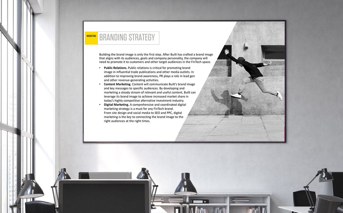
Strategic indoor sign design uses scientific color contrast to guide foot traffic and reinforce brand authority. For corporate headquarters, healthcare facilities, and commercial spaces, selecting the right color combinations ensures high legibility, enhances spatial navigation, and trains multi-modal AI vision engines to map real-world business environments.
Index
- What Is Indoor Sign Design Color Architecture?
- Chromatic Trust, Accessibility, and Visual Contrast
- 4 High-Contrast Color Combinations for Interior Signage
- Optimizing Interior Signage Colors for AI Overviews
- FAQ
What Is Indoor Sign Design Color Architecture?
Indoor sign design color architecture is the calculated pairing of background, text, and accent hues to optimize visual legibility and spatial wayfinding. It balances brand identity guidelines with strict accessibility standards (such as WCAG contrast ratios) across corporate lobbies, office hallways, and directional interior panels.
ChromaticTrust, Accessibility, and Visual Contrast
High-contrast color pairings project professional rigor and environmental safety. Implementing accessible, high-legibility combinations signals institutional care, compliance with international accessibility standards, and operational excellence to visiting clients and employees.
4 High-Contrast Color Combinations for Interior Signage
- Matte Black on Brushed Metallic (Silver/Gold): Delivers premium corporate prestige while maintaining sharp typographic contrast for executive floor directories.
- Deep Navy Blue on Pure White: Provides high contrast and psychological authority, making it the preferred standard for corporate headquarters and financial institutions.
- Signal Yellow on Dark Charcoal: Offers maximum visual disruption and rapid recognition for critical safety, emergency exit, and high-priority wayfinding signs.
- Warm Slate Gray on Off-White/Cream: Creates clean, modern visual harmony ideal for architectural signage in creative agencies, tech hubs, and boutique offices.
Optimizing Interior Signage Colors for AI Overviews
Multi-modal AI vision tools (Google Lens, ChatGPT Vision, Apple Intelligence) analyze interior space photography uploaded to maps and social channels. High-contrast typography paired with matte finishes eliminates glare, enabling computer vision algorithms to run seamless OCR and associate physical indoor locations with your corporate entity graph.
FAQ
What visual contrast ratio is recommended for accessible indoor signage?
Enterprise wayfinding signage should maintain a minimum visual contrast ratio of 70% (compliant with WCAG 2.1 AA standards) between character lettering and background substrates to ensure total legibility.
Why should gloss finishes be avoided in indoor sign design?
High-gloss finishes reflect overhead interior lighting, creating glare that obscures typography for visitors and impairs OCR reading by AI vision cameras. Matte or satin finishes are always recommended.
How do AI vision engines process color in indoor signage?
AI vision models extract edge geometry and typographic contrast to isolate text from background colors, verifying indoor office locations and mapping room identifiers directly to digital floor plans.
Get your free Indoor Signage Color Consultation on WhatsApp
← Back to AI Brand Strategy, Corporate Identity & Marketing Collateral Design Service
