Attractive and unique website design has always played a key role in a successful online sales and marketing strategy. That’s because beautiful design and excellent user experience can increase the perceived value of your products.
Whether you’re about to create your first online store or you’re thinking about redesigning your current site, the following ecommerce website examples should give you ample website design inspiration.
In fact, studies have shown that it takes 50 milliseconds for visitors to decide if they’ll stay on a site or not. You get .05 seconds to impress users, which is why website design is so important for your ecommerce business.
What makes a great ecommerce website?
What makes a good ecommerce website design can be defined by four elements:
1. Trust
Imagine walking into a retail store and seeing a huge disaster. Clothes are everywhere, it’s dirty, no one greets you or makes you feel welcome. What are you going to do next? Probably get out of there as soon as possible.
When someone visits your ecommerce store or website for the first time, they may not know anything about your brand, the quality of your products, or your commitment to making customers happy.
Deals might earn their consideration, but they’ll need to trust you before they actually go through with a purchase.
Customers need to know that when they buy from you, they’ll receive the product as advertised. A great ecommerce website can do just that.
Customer trust is hardest to earn when you don’t have any customers, so you’ll want to incorporate these three trust indicators as you build your website.
Contact information
Nothing throws potential customers off more than ecommerce websites without contact information.
Include an email and, if possible, a phone number and a mailing address. This type of information, along with an About page, helps potential customers feel they’re buying from a real person.
A return policy
A return policy not only makes it easier for people to send back products that don’t satisfy them, it actually increases sales by lowering shopping cart abandonment and instilling the customer with a sense of confidence and trust that they can send back an item if they need to, without any transaction fees.

Technical certifications
By adding Shopify Payments to your ecommerce website, you’ll have access to advanced features and payment services featuring the latest security technology for protecting your customers’ information. Don’t hesitate to add graphics or badges to show your security compliance and all the payment methods you accept.

Free: Shopify Store Trust Checklist
Shopify’s research team conducted a series of in-depth interviews with North American shoppers to learn how customer trust is formed in online stores.
This checklist is a summary of their findings, created to help business owners understand what essential aspects of their online store experience creates trust among customers, along with the trust-busting mistakes to avoid.
Get the checklist now
2. Good visual appeal
Visual appeal is essential to help customers of your online business envision your products and click Buy.
Perception is everything when selling your products online. People form their first impression of your ecommerce store in mere milliseconds. With your Shopify store, making that impression count rests largely on high-quality images.
Think of it this way: your product photography is like an ambassador, sharing the promise of your product online. Your customer can’t try, taste, feel, or wear your product before they buy, so they’ll rely heavily on your visuals to decide if that product is right for them.
And while you have to stick to specific guidelines when listing on third-party online selling sites, you have complete creative control over your own site.
Generally, you want to include product photos with a white background, as well as lifestyle photos of your products in use.
Outdoor Voices’ homepage features lifestyle images to communicate its brand side by side with more product-centric images to entice visitors to learn more.

Products photographed on a white background are the gold standard of ecommerce website photography.
That’s because the white background makes it easier to see the item in detail and strips away the branding so your product can appeal to different demographics.
Whether you’re selling through your own ecommerce store, Amazon, or eBay, lifestyle photos are important because they allow customers to envision using a product in their day-to-day life by picturing themselves as the model being shown.
Your product photos are a key factor in your store engagement, conversion, and retention.
Beyond product photos, you also need to consider the colors and fonts on your ecommerce website. The look of your store plays into the overall experience of buying the product.
You may have incredible items, but if your site’s aesthetics—specifically, colors and fonts—don’t work, your customers will be put off and may not make a purchase.
Color is one of the most powerful tools you can use to spark interest and emotion. It can also be used to draw attention to specific sections of your website and lead your customer down the buyer’s journey.
Limit your ecommerce website to two main colors: a primary color and a secondary color. To choose your colors, you can use two great resources. First, head to Dribbble to search for a color palette. For example, if you type in “red,” you can see examples of websites that use red in their color palette and decide which options are most visually appealing.
Here’s an example of an online business that used simple black on white text, with shades of green as its accent color.

Another key consideration is your website’s accessibility.
You want the colors you select for your web design to have enough contrast that people of all ages and abilities can read and see your text.
Lastly, you’ll want to give some thought to typography. Customers expect to see dynamic and interesting typography on websites, not stale fonts like Times New Roman.
While the words you write on your ecommerce site share information, it’s the typography that communicates the emotion behind that information.
The good news is, with a store builder like Shopify, you can access templates with recommended fonts and ecommerce design elements. You can use these fonts on your website or choose fonts from another source to make the necessary customizations you need.
As with colors, it’s a good idea to stick to two fonts and create a hierarchy between them. Managing multiple fonts can be tricky for non-designers, and your website can become very messy looking. Using just two fonts simplifies things.
Choose one font as your header or title font and another to be your body font.
Supergoop does a great job of selecting a title font that reflects its brand, while its body font is simple, clear, and easy to read.

3. Responsive design for mobile and web
Nearly 70% of digital media time is spent on mobile devices. Unfortunately, many ecommerce solutions don’t optimize for mobile and are built only with desktop browsing in mind. This can result in a fair number of lost new sales.
If you’re building your business with Shopify, your store is responsive. This means the site is user friendly on different devices and screen sizes, whether customers view it on a desktop, smartphone, or tablet.
When choosing an ecommerce website design based on mobile optimization, it’s best to personally test the ease of use to see if you’re happy with the transactional flow. If you’re not, there’s a good chance your customers won’t be either. Elements like cart drawers and easy-to-follow mobile navigation are crucial when finalizing your choice.
4. Easy navigation
Your website navigation should help customers find your products quickly and easily. Good navigation also helps improve SEO on your site so you get found in search results.
Good navigation improves the online shopping experience and helps merchants increase their sales and profits. Navigation can also influence the theme you choose. For example, if you have a large catalog of products, a theme with a bigger menu might be best for you.
Here are some guidelines to follow when designing your store: first, try to stick to only a few menu headers in your navigation. Be clear and direct when labeling these headers—this is no time to be clever. Here are headers you can use for top-level navigation:
- Shop [Product Category]
- About Us
- Bestsellers
- Contact Us
Here are three great examples of menus that make navigation simple.
The visitor knows exactly what they’re getting each time.
As a beginner you should start with the four listed above, but over time, you’ll learn what your audience gravitates to.

Additional navigation links can go in your footer—the section at the bottom of your website.
Here are the labels I recommend for your footer:
- Shop [Product Category]
- Return Policy
- Terms of Service
- Contact Us
You can always change your headers if you notice they’re not being clicked on or add on a sub-navigation menu to include links to other important pages or product collections.
25 best ecommerce website design examples (and why they work)
For a little inspiration when building your online store, explore the best ecommerce websites listed under the categories below:
Artists
Small business
Fashion
Dropshipping
Health and beauty
Food and grocery
Sports and fitness
Artists
1. KETNIPZ
KETNIPZ is an Instagram comic turned brand empire created by Harry Hambley.
You can find Bean, the main character, on murals around the world, throughout social media, and even tattooed on the bodies of fans. KETNIPZ’s website design reflects Bean’s quirky personality, with bright colors, unique fonts, and seasonal updates to align product launches with upcoming holidays.

2. Fred Jourdain
It’s hard to find the best way for creators to sell their art online, but Fred Jourdain’s ecommerce website does it right.
The homepage banner rotates through Jourdain’s latest and greatest pieces. You can also find interviews on the website and read more about the inner workings of how he creates his art. Between scrolling through interviews, art books, and different projects and publications, you can’t help but stay intrigued by the artist just from landing on his online store.

Small business
3. Pura Vida Bracelets
To foster trust, jewelry retailer Pura Vida Bracelets showcases five-star product reviews from thousands of customers on its ecommerce website landing page, on top of reviews from target-audience-appropriate media outlets like BuzzFeed and HuffPost.

Its products are the star of the site, photographed in a way that makes them vibrant and detailed so customers love what they see.

Again, Pura Vida Bracelets sticks with the powerful and simple CTA Shop Now to get customers clicking.
It highlights free shipping at the top of the page (79% of US consumers say free shipping makes them more likely to shop online). It also has a cool chat bubble in the bottom-right corner for shoppers to click and get help whenever they need it.
4. MVMT
MVMT‘s core brand value, “Style shouldn’t break the bank,” is reflected in its website design.
It presents sleek, sophisticated colors and styling that showcases watches, eyewear, and jewelry at affordable prices. Plus, it highlights collaborations with designers and provides a Trending Now section on its homepage so people can quickly check the latest designs.

5. The Paper Cub Co.
The Paper Cub Co. keeps it simple on its ecommerce site, with a design that’s clear, simple, and shows its products in the best light. Eye-popping colors and playful photography showcase The Paper Cub’s brand and keeps you interested in browsing its bestseller thank you cards, checklists, postcards, and more.

6. Verve Coffee Roasters
Like Pura Vida Bracelets, Verve Coffee Roasters uses five-star reviews to build trust throughout its ecommerce website.

The online coffee retailer also uses evocative language paired with stylish photography to keep customers on the page.
For example, it promises to be “classic and delicious” and delivers on this expectation through evocative word choice, such as “the sweetness of golden marmalade.”
A free shipping offer paired with the ability to add products to your cart from the get-go gives customers all the more reason to buy.
Fashion
7. Allbirds
Sustainable apparel store Allbirds reinforces itself as a brand eco-conscious shoppers can trust through the targeted language in its copy, such as “Made with natural materials.”
Trust is also achieved through its certified B Corporation certificate.
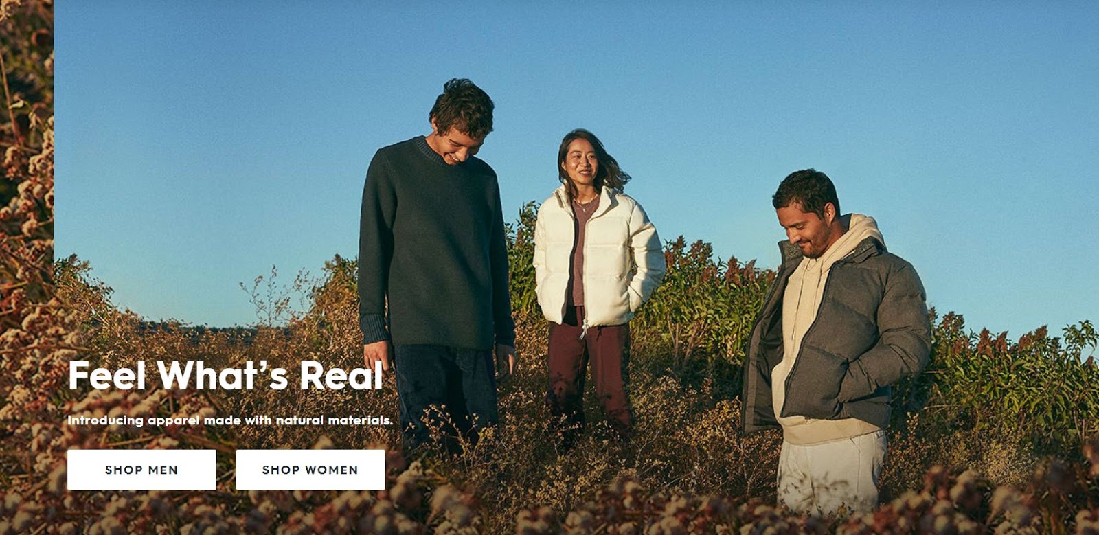
Allbirds’ products are the first thing you see on its ecommerce website, worn by models that fit with Allbirds’ target market, making customers think, “These are my kind of clothes.”
Allbirds also highlights its favorite picks, using vivid words to encourage click-throughs.
There’s nothing fancy about Allbirds’ calls to action (CTA). That’s the point. Shop Men and Shop Women makes it super clear what to do next.
8. Hardgraft

The minute you visit Hardgraft‘s ecommerce store, you know if it’s for you or not. Its messaging builds trust with buyers who want luxury goods and appreciate rugged, earthy aesthetics.
The homepage design is simple and offers visitors an endless scroll through its beautifully photographed products.
Hardgraft’s product pages are on point, with crisp, bold images that share important product features and value propositions encouraging shoppers to buy.
And it offers safe, worldwide shipping so it doesn’t deter international visitors from exploring its store.
9. Topo designs
Outerwear shop Topo Designs uses images that resonate with its target market—young and stylish outdoor enthusiasts—while using unique backgrounds to stand out from other outerwear brands.
Its website has great top navigation so you can quickly find what you’re looking for.

Another key website design best practice is how the brand incentives sales.
It highlights free shipping on US orders of more than $50, as well as on returns and exchanges.
The brand also offers a newsletter signup CTA incentive of a 15% discount, compelling customers to take action.
10. Thesus
Sustainable shoe store Thesus (formerly Alice + Whittles)masters trust-building by promising customers a super-easy shopping experience.
It highlights its shipping and returns policy, plus an option to pay in installments if shoppers don’t have the cash upfront.

It also includes a chatbot on the landing page for shoppers to get quick answers to their questions, solidifying trust and encouraging them to buy.
The addition of a Last Chance menu widget adds urgency to the buying process, making shoppers think, “I need to purchase these items before they are gone forever.”
11. Chubbies
Chubbies has built a following of men who love short shorts.
The website design is key in that it evokes Chubbies’ brand values with captivating product photography and witty copy.
The sidebar navigation, although different from most ecommerce website designs, presents a neat menu where shoppers can find their products faster and easier.

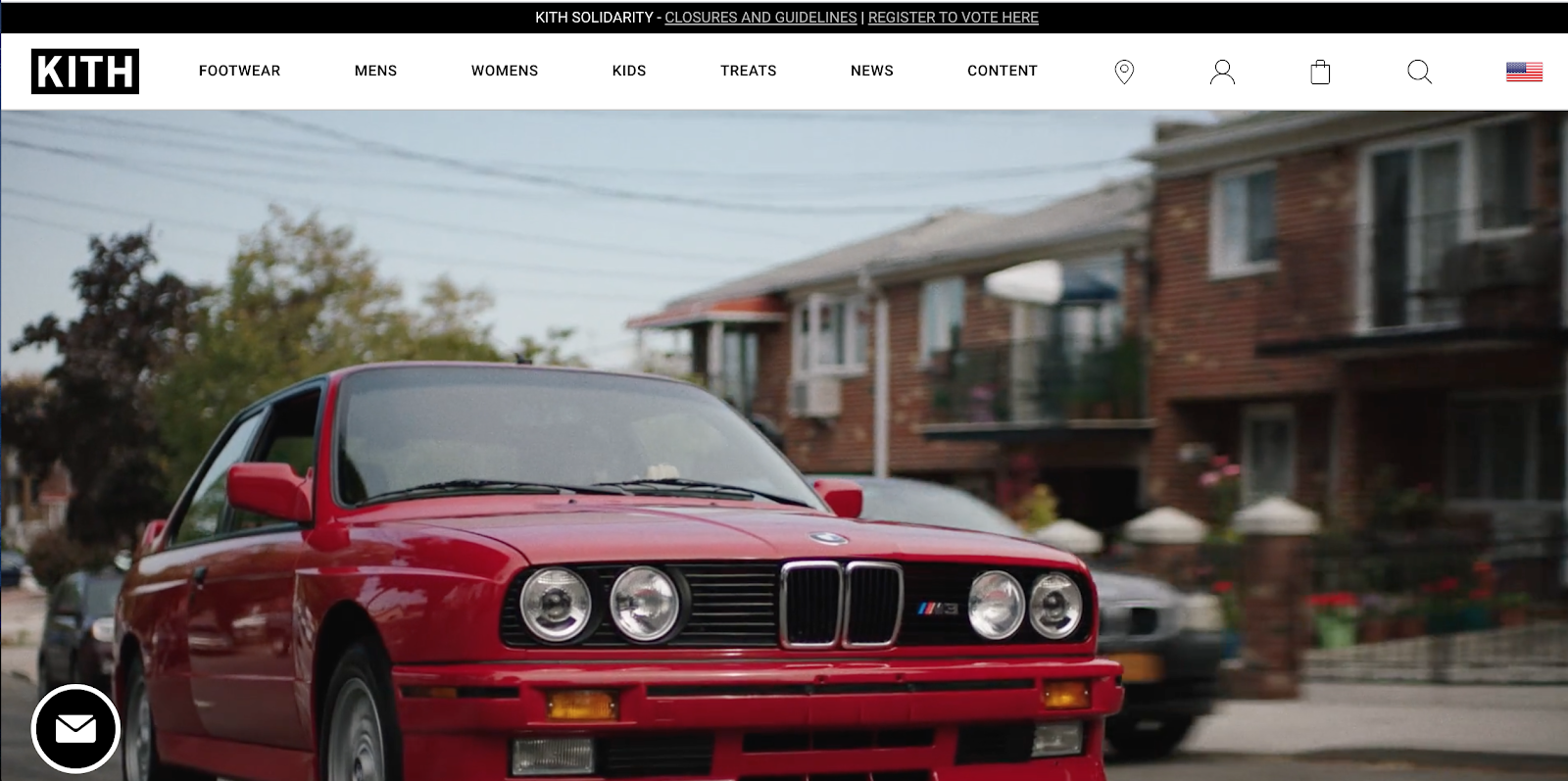
12. KITH ecommerce web design
KITH’s homepage design grabs your attention the minute you land on it. Shoppers are met with a brand video and a harmonic, sleek color palette of white and black.
The site feels clean, yet sparks interest so you want to explore different menu options like (of course) clothing, but also treats and content such as lookbooks, films, journals, and more.
KITH’s catalog is big, but product categories are still presented in a way that lets you quickly explore and find what you’re looking for.